Quick Links for Colors
Why Natural Light Appears White?
Sunlight appears white because it contains all visible wavelengths mixed together. When light passes through a prism or raindrops, each wavelength bends differently due to dispersion, separating the colors.
Main Colors of Natural Light: Red, Orange, Yellow, Green, Blue, Indigo, Violet (红、橙、黄、绿、蓝、靛、紫).
Natural light contains a continuous spectrum from violet (~380 nm) to red (~750 nm), and the visible colors we see arise from how light interacts with atmosphere, materials, and optical elements.
The main colors of the rainbow, in order from outside to inside, are red, orange, yellow, green, blue, indigo, and violet. Often remembered by the acronym ROYGBIV, this sequence represents the visible spectrum of light. While often cited as seven distinct colors, it is a continuous spectrum.
Black is the most popular and dominant smartphone color, chosen for its sleek, professional, and timeless look. Following black, white/silver and blue are top choices, with blue often favored for its modern, tech-forward appeal. While neutrals dominate overall sales, shades like purple, green, and red have become popular in trendy or flagship models.
-
Black / Midnight / Graphite / Gray: Consistently ranks #1 sales due to its classic, discreet appearance.
-
White / Silver / Natural Titanium / Star Light: A top alternative to black, favored for a clean, minimalist aesthetic.
-
Blue / Navy / Sky Blue: Highly popular among consumers, often viewed as a trendy yet versatile option.
-
Green / Sage Green / Mint: Growing in popularity, offering a sophisticated, nature-inspired alternative to neutrals.
-
Purple / Lavender / Lilac: Frequently used for new, flagship phone launches to add a touch of individuality.
-
Red / Pink / Maroon / Burgundy: A popular bold choice for consumers looking to make a statement.
-
Gold / Rose Gold: Popular particularly in Asian markets, as a sign of luxury and richness.
While black dominates, market trends show that around 82% of users are willing to choose a phone in their favorite, often more vibrant, color.


The study of colors—often referred to as color theory—is a rich, interdisciplinary field that spans art, science, psychology, culture, and technology. Colors are far more than visual sensations; they influence perception, emotion, behavior, communication, and even decision-making. Understanding color means understanding how humans see the world and how meaning is constructed through visual experience.
1. The Science of Color
From a scientific perspective, color begins with light. Visible light is a small portion of the electromagnetic spectrum, with wavelengths roughly between 380 and 750 nanometers. Different wavelengths correspond to different colors—violet at the shorter end and red at the longer end.
When light strikes an object, some wavelengths are absorbed while others are reflected. The reflected wavelengths are what the human eye perceives as color. For example, a red apple appears red because it reflects red wavelengths and absorbs most others.
The human eye contains specialized photoreceptor cells called cones, which are sensitive to different ranges of wavelengths:
-
S-cones (short wavelengths) respond mainly to blues
-
M-cones (medium wavelengths) respond mainly to greens
-
L-cones (long wavelengths) respond mainly to reds
The brain combines signals from these cones to create the full spectrum of perceived color. This process explains why color perception is not purely objective—it is shaped by biology and neural interpretation.
2. Color Theory and Color Systems
Color theory provides a structured way to understand how colors relate to one another. One of the most common tools is the color wheel, traditionally attributed to Isaac Newton. Colors are often categorized as:
-
Primary colors (red, blue, yellow in art; red, green, blue in light)
-
Secondary colors (green, orange, purple)
-
Tertiary colors (combinations of primary and secondary colors)
Different color models are used depending on context:
-
RGB (Red, Green, Blue) is used for digital displays and light-based systems.
-
CMYK (Cyan, Magenta, Yellow, Black) is used in printing.
-
HSV/HSL models focus on hue, saturation, and brightness/lightness, making them intuitive for design and image editing.
HSV & HSL: HSV (Hue, Saturation, Value) and HSL (Hue, Saturation, Lightness) are cylindrical-coordinate transformations of the RGB color model, designed to be more intuitive for human color selection than raw red-green-blue values. Core Components:
-
Hue (H): Represents the "type" of color (e.g., red, blue, yellow) and is measured in degrees (0° to 360°) on a color wheel.
-
Saturation (S): Describes the "purity" or intensity of the color. 100% is the pure hue, while 0% is a shade of gray.
-
Value/Lightness (V/L):
-
Value (HSV): Often called Brightness (HSB). It ranges from black (0%) to the brightest version of the color (100%).
-
Lightness (HSL): Ranges from black (0%) to pure white (100%), with the pure color located at 50%.
-
Chroma: Chroma is distinct from hue (the name of the color, like red or blue) and value (the lightness or darkness of the color). It refers to the saturation/intensity/purity of a color, defining how vivid or "clean" it is compared to a neutral gray of the same brightness. High-chroma colors are vivid and intense, while low-chroma colors are muted, dull, or grayish.
Key Aspects of Color Chroma:
-
Purity vs. Grayness: Chroma measures the departure of a color from a neutral gray. A primary red has high chroma, while a dusty, gray-toned rose has low chroma.
-
Relation to Saturation: In many contexts, particularly art and digital photo editing, chroma is often used interchangeably with "saturation" or "intensity".
-
Measurement: In the Munsell color system, the scale starts at zero (neutral gray) and extends outward, with no strict upper limit, although common materials rarely exceed 20.
-
Maximum Chroma: Different hues reach their maximum intensity at different levels of value (lightness). For instance, yellow is most intense at high values, while blue is most intense at low, dark values.
-
Context: Chroma is essential for color harmony. Colors with similar or related chroma levels tend to complement each other well.
3. Psychological and Emotional Effects of Color
One of the most fascinating aspects of color study is its impact on human emotion and behavior. While responses can vary by individual and culture, certain associations are commonly observed:
-
Red is often linked to energy, passion, urgency, and danger.
-
Blue is associated with calmness, trust, and stability.
-
Yellow can evoke happiness, optimism, or caution.
-
Green is commonly tied to nature, growth, and balance.
-
Black may suggest elegance, power, or mourning.
-
White often symbolizes purity, simplicity, or cleanliness.
These psychological effects are widely used in marketing, branding, interior design, and user-interface design. For example, banks often use blue to convey trust, while fast-food brands use red and yellow to stimulate appetite and attention.
4. Cultural and Symbolic Meanings of Color
Color meanings are not universal. Cultural context plays a crucial role in how colors are interpreted:
-
In many Western cultures, white represents purity and weddings, while in some East Asian cultures it is associated with mourning.
-
Red symbolizes luck and prosperity in China but may signal warning or danger in other contexts.
-
Purple has historically been associated with royalty and wealth due to the rarity of purple dyes.
Artists, designers, and communicators must understand these cultural dimensions to avoid misinterpretation and to communicate effectively across societies.
5. Color in Art and Design
Artists have long explored color as a primary expressive tool. Movements such as Impressionism, Fauvism, and Abstract Expressionism pushed color beyond realistic representation into emotional and symbolic realms. Designers use principles such as:
-
Color harmony (pleasing combinations)
-
Contrast (visibility and emphasis)
-
Balance (visual stability)
-
Temperature (warm vs. cool colors)
In visual communication, color helps guide attention, convey hierarchy, and reinforce meaning without words.
6. Color in Technology and Everyday Life
Modern technology relies heavily on precise color control. Screens, cameras, printers, and even semiconductor manufacturing processes require accurate color calibration and management. Color science is critical in:
-
Medical imaging
-
Remote sensing and satellites
-
Virtual and augmented reality
-
Quality inspection and machine vision
In everyday life, color affects everything from road safety (traffic signals) to education (learning materials) and accessibility (color contrast for the visually impaired).
7. The Subjectivity of Color
Despite scientific measurement, color remains deeply subjective. Factors such as lighting conditions, surrounding colors, age, vision differences (like color blindness), and personal experience all influence perception. This subjectivity makes color both powerful and complex—it is a shared experience, yet uniquely personal.
Conclusion
The study of colors is a bridge between physics and emotion, biology and culture, objectivity and interpretation. Whether applied in science, art, engineering, or daily life, color shapes how we understand and interact with the world. By studying color deeply, we gain insight not only into visual systems but also into human perception, communication, and creativity.
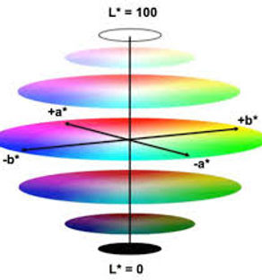
The CIELAB color space, also referred to as L*a*b*—often written Lab—is a device-independent color space designed so that numerical differences match human visual perception. That’s why it’s the gold standard for color measurement, comparison, and quality control. L*a*b* turns human color perception into numbers you can control, compare, and tolerance.
1. What L*, a*, b* mean
Think of Lab as a 3-axis coordinate system:
L* — Lightness = 👉 How light or dark the color is
-
Range: 0 → 100
-
0 = perfect black
-
100 = perfect white
a* — Green ↔ Red axis = 👉 Color shift along green–red
-
Negative a* = green
-
Positive a* = red
b* — Blue ↔ Yellow axis = 👉 Color shift along blue–yellow
-
Negative b* = blue
-
Positive b* = yellow
📌 Neutral gray is accurately defined in the CIE L*a*b* (CIELAB) color space as L* = 50, a* = 0, b* = 0. At these specific coordinates, the color has no hue or saturation, placing it on the achromatic axis between white and black.
2. Why Lab is so important
✅ Device-independent (unlike RGB)
✅ Perceptually uniform (numbers mean something visually)
✅ Works across materials, lighting, and processes
✅ Ideal for specs, tolerances, and pass/fail criteria
That’s why Lab is everywhere in:
-
Manufacturing QA
-
Printing & coatings
-
Plastics & paints
-
Semiconductor tool optics & panels
-
Display and imaging calibration
L*a*b* Measurement
CIELAB (L*a*b*) measures color via three axes: L* (lightness: 0=black, 100=white), a* (red/green), and b* (yellow/blue). It calculates total color difference, from a standard. Gloss, measured in gloss units via ASTM D523/ISO 2813, quantifies surface shininess, affecting perceived color. Both are essential for precise, consistent appearance analysis.
Typical workflow
-
Illuminate sample with controlled light (D65 common)
-
Measure reflected light spectrum
-
Convert to XYZ
-
Convert XYZ → L*a*b*
Gloss Measurement
-
Definition: The specular reflection of light from a surface, measured in Gloss Units (GU).
-
Angles: Measured at 20° (high gloss), 60° (medium), or 85° (low gloss) depending on the surface finish.
-
Impact on Color: High-gloss surfaces appear darker because they reflect light directly away (specular), while matte surfaces appear lighter due to diffuse, scattered reflection.
Integrated Measurement
Modern, high-end spectrophotometers (e.g., d/8° sphere geometry) can measure color and gloss simultaneously. This is crucial because two samples can have identical values but look different due to varying gloss levels.
Key Differences
-
L*a*b*: Defines what color it is (pigment, hue, saturation).
-
Gloss: Defines how the surface reflects light (shiny vs. matte).
Commonly Used Instruments
-
Spectrophotometers: Measure color, higher accuracy, spectral data.
-
Gloss Meters: Measure gloss units.
-
Combined Units: Such as the Konica Minolta CM-26dG, measure both.
4. Color difference: ΔE (Delta E)
Lab really shines when comparing colors. ΔE quantifies how different two colors look. Basic formula (ΔE*ab):
Practical interpretation:
Basic idea: ΔE = how different two colors look to humans
Common standards:
-
ΔE*ab (1976) – simple, older
-
ΔE94 – improved weighting
-
ΔE00 (CIEDE2000) – industry standard today
Rule-of-thumb for ΔE Visual Difference
-
< 1.0 - Not perceptible
-
1–2 - Only experts notice
-
2–3 - Noticeable
-
> 5 - Obvious mismatch
5. Practical examples
Example Lab values:
-
Matte black panel: L*=12, a*=0.2, b*=-0.1
-
Warm white plastic: L*=92, a*=1.5, b*=8.2
-
Blue anodized aluminum: L*=48, a*=-2.1, b*=-22.5
Typical specs:
-
Cosmetic parts: ΔE ≤ 2.0
-
High-end optics / tools: ΔE ≤ 1.0
-
Non-visible internals: ΔE ≤ 3–5
6. L*a*b* vs RGB vs CMYK (quick contrast)
-
L*a*b*: Device-independent. Separates lightness from color, making it ideal for accurate color editing and ensuring consistent color reproduction across different devices (e.g., monitor to printer). It simulates human vision.
-
RGB: Device-dependent. Used for screens (monitors, phones). It is an additive process where light is added to create colors.
-
CMYK: Device-dependent. Used for printing. It is a subtractive process where inks are combined to absorb light, producing a smaller, more limited color gamut than RGB.
📌 Design in RGB, print in CMYK, specify & inspect in L*a*b*.
7. Pro tips (engineering & QA)
-
Always specify illuminant (e.g., D65)
-
Specify observer angle (2° or 10°)
-
Control surface finish (gloss affects readings)
-
Measure multiple spots → average
-
Use ΔE00, not ΔE76, for modern specs
8. Color control via lab dips
Lab dips are small, test-dyed fabric swatches used to match a target color standard (such as Pantone) before bulk production to avoid high-cost rejection of final production goods. Defined by a rigorous evaluation process, these samples are approved based on color accuracy, metamerism, and consistency under varied light sources (like daylight D65 or fluorescent) to prevent production waste.
Defining and Evaluating Lab Dips
-
Target Standard: The process begins with a color standard (swatch, Pantone, or digital data) that the dye house must match.
-
Multiple Options: Suppliers usually provide 2–3 options (labeled A, B, C) that differ in shade or formula, allowing for selection of the closest match.
-
Light Box Evaluation: Dips must be approved in an industry-standard light box to evaluate how the color looks under different lighting conditions (e.g., store light vs. daylight).
-
Evaluation Criteria: Key metrics include Hue, Value, and Chroma. They are judged on whether they are too light/dark, bright/dull, or red/green/blue/yellow.
-
Approval/Resubmission: The evaluator either approves the best option or provides specific feedback (e.g., "make 20% darker") for a revised submission.
Key Aspects of the Lab Dip Process
-
Goal: Ensuring consistency across vendors and materials (e.g., matching cotton with polyester).
-
Methodology: Small samples are processed in lab-sized dyeing machines, often following spectroscopic analysis of the required formula.
9. Major Color Standards
-
Pantone: Pantone provides a universal language of color that enables color-critical decisions through every stage of the workflow for brands and manufacturers. Each color is assigned a unique alphanumeric code, such as "PMS 185 C". The suffix indicates the finish: C for coated (glossy) and U for uncoated (matte).
-
RGB & HEX: Digital-only standards. RGB (Red, Green, Blue) is used for screens, while HEX (Hexadecimal) codes are the standard for web development. Hex color codes (e.g., #FF5733) work by representing RGB (Red, Green, Blue) color values in a base-16 hexadecimal format. The six characters are split into three pairs (#RRGGBB), where each pair represents the intensity of a color channel from 00 (minimum) to FF (maximum), offering 16,777,216 total color combinations.
-
RAL: The primary standard in Europe for coatings, plastics, and powder coating, often used in architecture and automotive industries.
-
NCS (Natural Color System): A Scandinavian standard based on human perception (how we see color) rather than ink mixtures, common in interior design.
-
HKS: A German color system used mainly in the European printing industry, similar to Pantone but with a different set of base colors.
-
DIC: A major color standard used primarily in Japan and parts of Asia.


Dedicated software for generating, managing, and visualizing colors based on L*a*b* (CIELab) data includes specialized tools for industry formulation and colorimetric analysis. Key options include ColorLab (DNA Phone) for web-based analysis, HunterLab's colorLab for device-controlled measurements, and ColorInLab's Color Lab for ICC-based spot color optimization. These tools allow importing L*a*b* (CIELab) data to create, analyze, and visualize color differences and color spaces.
Key Software Solutions for L*a*b* Color Generation:
-
ColorLab (DNA Phone) (Web App): Focuses on analyzing L*a*b*data, creating 2D/3D graphs, and calculating color differences, suitable for laboratory analysis.
-
HunterLab colorLab: A desktop application designed to control HunterLab spectrophotometers for precise color measurement, quality control, and data management.
-
ColorInLab Color Lab (Spot Color Optimization): Allows for the separation of L*a*b* colors using ICC profiles (v2 & v4) in various color modes (RGB, CMYK, Multi-Channel).
-
Datacolor Match Pigment/Textile: Professional formulation software that uses L*a*b* input to develop new color recipes, optimize dye combinations, and perform gamut mapping.
-
ColorLab (Universitat de València) (MATLAB Toolbox): A comprehensive, open-source toolbox for color image processing, visualization, and conversion between color spaces, including L*a*b*.
-
ColorWorkDesk: A specialized app for color management, formulation, and quality control, enabling precise color recipes.
These tools are essential for industries needing to match physical pigments, manage production quality control, or analyze color, providing numerical accuracy through the L*a*b* color space.
Color Visualization